Now, I have chosen a very fiddly picture for my challenge, but I chose it because it had plenty of light and shade. I am going to suggest that you all try something a little easier with less detail. The photo below was a colour photo and I used a basic photo shop programme to take out the colour. As I mentioned earlier, if you cannot do this on your computer send me you colour picture attached to an email and I will change it to black and white and send it back to you. It is much easier to see tone in black and white photos than it is in colour so this is our first step.

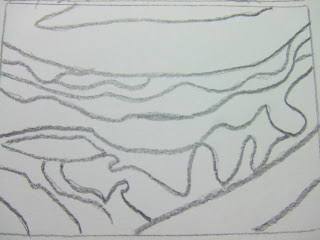
As you can see below this picture I have traced my image, there is nothing wrong with doing this, especially as we will be making a series of drawings, it makes the whole procedure easier.

Before we begin to draw the tone into our traced pictures we will look at tone separately, in the photo below you will see that I have made two charts. Each has 10 boxes in each chart, the first chart is shaded with a pencil a good soft 2b or softer would be great. The second is painted with designers gouache which is similar to poster paint. The idea is that you start with white and work towards black by adding and mixing in a little more black for each box.

There should be a steady progression, this will help to train your eye to see different tones. This is a small tonal chart, when I was studying my Art foundation course we had to make one with 20 boxes, but I think ten is enough for now.

Next I took my first tracing and shaded in the different tones in pencil, working from light to dark with as many different tones as I could work out in my picture. In some of the picture the paper is left unshaded, this is the lightest tone.

Then I used the gouache paint to work into my second tracing.

The next stage is to look at one colour, so I used a blue watercolour/blendable pencil and combined it with a 2b sketching pencil, to make another tonal chart. The white of the paper combines with the blue to make the lightest shade and the sketching pencil provides the deepest tone when blended with the colour pencil.

Then, yes, you’ve guessed it, I made another tonal drawing using the tones from the chart above.

Ok, in the last part of the drawing exercise, I’ve worked in the same way, as above but in paint, so here is a tonal chart using black, white and a colour of my choice to make a chart.

Below is the final picture using these colours, I have tried to simplify the image in this last picture as I am going to be working in felt for the textile image. I will be blending my felt, using dark brown and a cream natural fleece and adding a dyed coloured fleece to add the colour back into the tone, probably colours quite similar to this painting.

I am going to suggest that you choose any material or method to make this tonal piece. I can give you some suggestions but I think that you should work in a way that suits you best.
You could make a fabric or paper collage, by cutting up strips of fabric or tearing tones from a newspaper or magazine. You could even make a tonal chart first using these scraps so that you know what you have ready to make your picture. This particular method has been used successfully in schools for many years to help students see tones.
The images above are about the size of a postcard, you can make your images any size that suits you. Now, have I forgotten anything???? Oh yes, email me with a photo if you need it changing from colour to black and white.
If you have any questions just ask, but please enjoy it and be creative, remember you do not have to stick rigidly to this plan this is a guideline only, so long as your work is about tone that is the main idea of the challenge.
Good Luck Tricia x


