Saturday, 11 July 2009

Ok, my blog back to normal with a mixed bag.

Ok, so I've reclaimed my blog for me, lol. If you are looking for the challenge you need the forum now.
To begin with I have a couple of pictures to show you that I just had to share. Look carefully at this branch from my apple tree, is this friend or foe? I have never liked spiders much but for some reason this little fella really fascinated me. He had crab like legs and was completely white except for these red stripes on his side.

Here he is again below, making an exit, I think he realised he was being watched. Well, does anyone know anything about this arachnid? Is he native to the UK or did he come over on a trade wind or something?

Now for something that did travel to the UK. Last week I received some lovely pieces of textile from Teresa in Australia. First a very pretty coloured wet felt, the most beautiful blue you can imagine.

Then these fascinating prints from Teresa's native flora. Isn't it amazing and the colours are just so very rich. Teresa has sent these to me as she heard I was making a blanket quilt. I have decided to design something special around these at some point, when I have done so I will show you the finished pieces. Thanks again Teresa.

Right, I will add these to the forum later but just wanted to show what I had produced for this months challenge. The theme is Impressionism. I decided to make enough so that I could cut and make two postcards. One to swap and one to keep. The first one shows the felted picture.

The second below is shown with stitching.

Last but not least the last image shows what I have been working on for a few weeks now. Continuing on from the Art Deco Challenge I am still working on this theme to make a series of brooches. These are not actually taken directly from images but are inspired by those I am studying, I am trying to understand the essence of the era. I am trying to understand why I have always been drawn to this style. I do believe it is because I have a love of geometry; I also feel that the simple stylisation of the period is almost timeless. I feel that it can be brought into everyday use and not feel out of place. The brooches below are very much in progress. I tend to work from one to the other until I feel happy with the image. I hope you like them. Well, I think that's enough for one blog. I'll be back soon. Tricia x


Sunday, 28 June 2009

New Forum (July Challenge can be found on previous post)

For a little while now I have been using my blog to write up the challenges. I found it easier to use than the Yahoo site which hosts my challenge site. I have decided to open up a new blog as a Forum for the purpose of writing up the challenges and also to enable everyone to see the work that all our talented members create each month. I am hoping that even if you are not a member you might like to drop in from time to time and take a look at what will be a showcase. I hope that if you do drop by, you will leave a comment or two, it's always good to get feedback.
This will mean that I can have my own blog back, even if I do mention what is happening from time to time on the Challenge blog.
It's early days yet and I am in the process of waiting to hear from challenge members what they think of the idea. It will all depend on members as to whether this idea will work. I see it as a way of showing what the challenge ideas each month can achieve from each individual member. It is much easier to post to blogger than it is to Yahoo. I will still use Yahoo but I hope it will be more of an administrative/archival use than the Forum will be.
The Forum will be more friendly and easier to see. The facility of being able to write something next to photos in itself is much nicer than having to look up someones work and then try to find the write up about it in the messages.
This is what I hope the Forum will look like, a typical page entry might look something like this, not my best work but just an example:
June Challenge: Art Deco

Shown above is a page in my sketchbook of drawings that I made of Art Deco Textile patterns.
The picture below is of a small felt postcard (unfinished) based upon the drawings above.


Yes, I hope this will be the way forward for a much more interesting Textile group experience for everyone involved. If you are interested here is the link, just pop back when we are hopefully up and running. Go Create now.... Tricia x

Saturday, 27 June 2009

July Challenge: Impressionism/Post Impressionism.

Thanks to Ruth for suggesting Van Gogh and Sue for her suggestion of Impressionism I have decided to cover both this month as Van Gogh is representative amongst others of the period just after Impressionism.
There is plenty of scope with this months challenge. Please feel free to choose either of the movements as inspiration. I am including two links one for each. From these two pages on Wikipedia you can choose to research further because there are plenty of links to other sites. The good thing about Wikipedia is that it will define what that movement is all about and which artists were involved.
So for Impressionism click here and for Post impressionism click here.
When you are thinking about the work that you might produce try to consider the essence of that movement. For instance you could focus on how Seurat mixed paint by combining different colours separately on the canvas, in other words he would for instance place red and yellow dots next to each other to give the impression of orange when viewed from a distance. This is just one of the elements but Seurat was the master at this so he is a good example to illustrate what I mean. If you were to use this idea you could mix your colours in a similar way, for example with seed stitching.
When I talk about inspiration this should not just be limited to making a copy of a painting, you could use the style to produce your own image. At the very least, if you do feel you would like to depict water Lillie's (Monet style) then do try to find your own image of one, it will not only stretch you but be much more interesting to create.
Please try to make some quick sketches before you start if you have the time, this will ensure that you choose the best angle/composition/image to work on in textile.
Most of all enjoy! OK get creating...... Tricia.

Sunday, 17 May 2009

June Challenge - Art Deco

Hi everyone,

Are you all ready for a great challenge, well I hope it will be. I chose Art Deco because I feel it is one of the most beautiful art styles ever. I feel the classical is epitomized in this era.

I thought that I would have to do lots of research for this before giving you a long line of Links. That was not the case, I managed to find just the right site to help you to look at this style and research it completely. The site I am speaking of is the V&A just click here. I hope that this link will provide you with everything you will need to introduce you to the wonderful world of Art Deco.

The great thing about this site is that you can clearly see all sorts of objects including Textiles from which to derive some wonderful inspiration. When I say objects, this in itself is a real advantage, because if any of you are thinking of making anything in 3 dimensions like a box then looking at these objects could well give you a stepping off point. There is a very clear statement in the objects of this era. Similar lines can be seen in all sort of things ranging from radios to buildings. There is even an interactive map on this site that shows buildings in London that were built at that period.

I know I may sound as though I am raving about this style but I often think I was born too late. I would have loved to have dressed up in the clothes of this time. Yes, you've guessed, I love this Art Style.

So here is your challenge, take a long look at all the Art Deco on the V&A site, make some drawings, try to get to understand the very essence of the Style/Period. Choose an object to make using this as inspiration and off you go. Good Luck Tricia x

A Little Distraction

Or perhaps this should be titled a Big distraction. Gosh I forgot how much time a new puppy takes. I suppose after not being well it has been a good way to focus on something else.

Meet Spyro, (Cavalier King Charles Spaniel) he is meant to be my Son's new puppy but.... well, you know what that means if you are a Mum. It means that Mum does all the poop a scooping, and Son gets to play.


Spyro did not want to pose, he was in a playful mood.

Being playful is his favourite thing at present!!

Ok, this is the closest I am going to get to a portrait.

He can't be said to be modest either. Our old flat coat retriever pictured here is just so tolerant to having his ears chewed, I am so surprised that he doesn't bite back.
Be back soon with creative blog I promise.

Monday, 27 April 2009

May Challenge - Pattern - Swap

Inspiration from some very talented young students.

I noticed in my archived photos that I still had some lovely examples of some of my students work from the Secondary School (Year 7)where I used to work. We did amongst other things a project on pattern. Students were asked to research and source some examples of patterns. I must say, I was very pleased and impressed by their efforts and I do believe they very much enjoyed this project.
Some of the students were quite creative in their ideas, in the picture below, this student understood completely how to use pattern, she decided to draw a series of repeated objects in her first example. Then she almost discovered Cubism in her third example by shading in the repeated shapes in blue and thus creating different planes.

So, what is a Pattern? It really is simply the repeat of an object or shape. Pattern can be found everywhere.

It can be seen in Mathematics: geometry. It can be seen in nature.
If you would like to learn more about this there is an excellent resource here.

The work in the picture above shows a variety of patterns the last one in red and black is stunning, it is a copy of a Peruvian textile.
The last two pictures shows how the students worked with pattern from their initial research. They were designing tyes. What do you think?
Pretty good eh for 12 year olds.
Ok, what are we going to do this month? I would like to propose that we make some studies from where ever we can find pattern. Then lets do something a little different with our research. I thought that we could make a needle case/cover using our pattern on the front, this could be in any material, I will most probably use felt because it is an ideal fabric to store needles. When this is done we could do a swap. So if you would like to join in this swap I will ask you to sign up in advance. Please leave me a comment below if you would like to take part in the swap. Good Luck Tricia x


Saturday, 28 March 2009

April Challenge: Collecting Textures

Textiles - Textures, the two seem inseparable. There are many ways to create textures, you can draw textures by mark making but a very easy way to do this is to transfer marks from one surface to another.

For this challenge we will be using a technique named frottage, a french word which artist's use to describe rubbing: as in brass rubbings. I am sure that many of us as children placed a coin under a piece of paper and rubbed it with a crayon or pencil to reveal the decoration on the coin. Well, this is an extension of this.

It seems strange that these experiments we make when we are young get lost and forgotten, especially so because with a little practice these can produce some fantastic effects.

In the picture below you will see some scraps of textured wallpaper. I have collected many of these over the years. If you go into a decorating store and ask from time to time you can often come away with old wallpaper books that would just be destined for the local landfill. This is what I have used as examples for this challenge but I am sure that there are so many other surfaces around us all that could be used, even the simplest woven fabric has a texture that you can borrow for this challenge.

I apologise for the quality of the photos but seen below are some very quick simple rubbings that I made, just to work out which textures I could use. I find soft oil pastels work the best for rubbings. You can use crayons but it takes a bit more practice and a firmer texture. The technique of actually rubbing should be noted, that is, always work the pastel or crayon in one direction, do not rub both ways or the paper is likely to move. The thinner the paper the better, for this I have used newsprint.

In the next picture I have used a yellow oil pastel and after making a series of rubbings I have used a blue watercolour paint to make a resist, this highlights the textures even more.

The next picture shows my first experiment with landscape, I realise that the photos are not as good as the real thing but I'm sure that you get the idea.

Now there are many different ways that you could step off from this starting point. I can give you a couple of simple suggestions but it is up to you where you decide to take your experiments.

Here are a few ideas:

  • You could use these frottage resists to inspire some embroidery, looking at the textures to help you decide the stitches to use.

  • You could repeat the experiments using fine cotton instead of paper. Making the frottage onto cotton and then making a wash over the top.

I'm sure that you talented ladies can find lots of ways to take these initial experiments further, don't forget to try lots of different textures. Look for them wherever you go; fabrics, stone, brick, plastics, leaves all sorts of places. Make lots of rubbings before deciding how you will use these. Think how you will put the different textures together, you may wish to use a wash to make a resist or you may like to look at different stitches.

There is one other way you might like to use textures, you could use it to print with. Depending where your texture is found. For instance, you could glue some samples of textured wallpaper onto board and use it to print with.

I hope that this challenge will inspire you to create work as marvellous as the work that you have made in all the previous challenges. You have all done so well in the last 3 months, keep up the good work. Good Luck Tricia x

Sunday, 22 March 2009

Happy Mother's Day - and work in progress

A Very Happy Mother's Day to one and all.


We have been looking at colour on the Textile Challenge site this month so to look at these flowers it seems an obvious statement to acknowledge and praise the wonder of natures colours. These flowers are a little more vibrant in real life; a deeper pink. In the real flower the yellow seems to sing in the centre of such a pink. I would probably be quite hesitant if putting these two colours together, but nature does it wonderfully albeit with mans intervention, I accept that these Chrysanthemums have probably been hybridised by selection.

There have been some wonderful examples of experiments in colour from members of the textile group, I do feel that we can all learn by each of these. I feel it has been a very useful challenge indeed.

My own efforts have been based around my fascination with changing light and sky colours and the effect that these have on the landscape. I have not entirely mastered what I wanted to acheive but I have made a start. Seen below are the first attempts in looking at group of Silver birch trees with a darkened stormy sky in the background. This scene also fascinates me because the field in the background appears almost gold in colour, even though it is actually just a field of grass, it is the sky and light which seems to effect it. A few minutes before this stormy sky appeared, this field appeared as green as the one in the foreground. It is amazing what you can see when you take the time to watch the changing light.


This felted piece is only work in progress and still needs a lot of stitching. As can be seen in the detail below. I will try to remember to show the finished piece when it is done.


Friday, 27 February 2009

Playing with colour.

Hi all,
After spending a while in A & E this week, I have been warned to take things easy. I was in for Tachycardia with a heart beat of 185 beats per minute. Well, after feeling as though I have just run two marathons, needless to say I feel very tired. This is as far as I am concerned a really good reason for me to cheat, there is no good reason to reinvent the wheel or the colour wheel come to that so I am going to be helping you play with colour by looking at one or two really good sites I have been researching.

Now this challenge is going to be offered to you in three different ways.
For those of you who have never ever taken a look at a colour wheel, or indeed any of you who would like a refresher course in the basics I will ask that you go to this site here .
If you would like to be stretched a little in your knowledge of colour theory then I will ask you to look at the following site which deals with colour in context, this features the theories of Joseph Albers of Bauhaus fame; this part of colour theory is fascinating as it shows how one colour effects another.
The last of the sites I will direct you to deals with Discords , we have all heard about harmonies well discords put quite bluntly are those that we normally associate with colours that clash. This is not to say that they can never be used. It depends on so much but I hope those of you who know a lot about colour theory will take a look at discords you may learn quite a lot.
Now to your challenge, after choosing and reading your chosen area of colour theory you are asked to create a piece of work that shows what you have learned. Please make this at least postcard size, or larger if you would like. You may make your work in any media and you might like to try some colour sketches first. Good Luck everyone. BFN Tricia

Monday, 9 February 2009

Felt and pheasant


Featured above is the finished tonal piece that I made for the Tonal Challenge on the previous post. This piece is the size of a postcard and is made purely from needle made felt on an embellisher. These challenges are part of the Challenge Site that I run, anyone can join just by clicking on the Challenge button to the left of this post.

Shown below is the weather we have been having in Kent recently, this was almost like a blizzard at some points. The Uk has predicted A Winter Storm later today and early tomorrow. What a contrast it is compared to the awful situation in Australia. My heartfelt wishes go out to all those who found themselves in the path or such terrifying fires. I will wish for rain and cooler weather for Australia and hope that the situation soon passes.


The picture below is another brooch that I made recently to give to the very kind person who gave me such wonderful Embroidery Magazines. Thanks again Patricia.


I thought that you might like to see what opportunists we have visiting our garden this winter. This pheasant decided that he was just as entitled to the fall from our bird table, infact at times he thought it fun to chase away the blackbirds, cheeky thing, it's such a good thing our dog wasn't out there!

Friday, 30 January 2009

February Challenge: Tone.

This challenge has taken me quite a bit longer to prepare, I will attempt to show you step by step the way in which I have worked. Please remember that you do not have to follow these steps to the letter. You can deviate from this route at any point and/or come back to it; just dip in where, when and in whatever way it suits you, the main thing is to try something new and have a go as it were.

Now, I have chosen a very fiddly picture for my challenge, but I chose it because it had plenty of light and shade. I am going to suggest that you all try something a little easier with less detail. The photo below was a colour photo and I used a basic photo shop programme to take out the colour. As I mentioned earlier, if you cannot do this on your computer send me you colour picture attached to an email and I will change it to black and white and send it back to you. It is much easier to see tone in black and white photos than it is in colour so this is our first step.

As you can see below this picture I have traced my image, there is nothing wrong with doing this, especially as we will be making a series of drawings, it makes the whole procedure easier.

Before we begin to draw the tone into our traced pictures we will look at tone separately, in the photo below you will see that I have made two charts. Each has 10 boxes in each chart, the first chart is shaded with a pencil a good soft 2b or softer would be great. The second is painted with designers gouache which is similar to poster paint. The idea is that you start with white and work towards black by adding and mixing in a little more black for each box.

There should be a steady progression, this will help to train your eye to see different tones. This is a small tonal chart, when I was studying my Art foundation course we had to make one with 20 boxes, but I think ten is enough for now.

Next I took my first tracing and shaded in the different tones in pencil, working from light to dark with as many different tones as I could work out in my picture. In some of the picture the paper is left unshaded, this is the lightest tone.

Then I used the gouache paint to work into my second tracing.

The next stage is to look at one colour, so I used a blue watercolour/blendable pencil and combined it with a 2b sketching pencil, to make another tonal chart. The white of the paper combines with the blue to make the lightest shade and the sketching pencil provides the deepest tone when blended with the colour pencil.

Then, yes, you’ve guessed it, I made another tonal drawing using the tones from the chart above.

Ok, in the last part of the drawing exercise, I’ve worked in the same way, as above but in paint, so here is a tonal chart using black, white and a colour of my choice to make a chart.

Below is the final picture using these colours, I have tried to simplify the image in this last picture as I am going to be working in felt for the textile image. I will be blending my felt, using dark brown and a cream natural fleece and adding a dyed coloured fleece to add the colour back into the tone, probably colours quite similar to this painting.

I am going to suggest that you choose any material or method to make this tonal piece. I can give you some suggestions but I think that you should work in a way that suits you best.

You could make a fabric or paper collage, by cutting up strips of fabric or tearing tones from a newspaper or magazine. You could even make a tonal chart first using these scraps so that you know what you have ready to make your picture. This particular method has been used successfully in schools for many years to help students see tones.

The images above are about the size of a postcard, you can make your images any size that suits you. Now, have I forgotten anything???? Oh yes, email me with a photo if you need it changing from colour to black and white.

If you have any questions just ask, but please enjoy it and be creative, remember you do not have to stick rigidly to this plan this is a guideline only, so long as your work is about tone that is the main idea of the challenge.

Good Luck Tricia x

A wonderful trade and a lucky find!

I've been such a lucky thing this week, I was approached by Lisa to make a trade, she does the most amazing ATC's often using old photos (ephemera.) I was rather cheeky when she asked me what I would like to choose, I asked her if she could make me something special for my Grand daughter who has recently auditioned in the first part of the process for the Royal Ballet School. For those of you who haven't heard about my talented little Grand daughter, she was a Champion Acro Gymnast winning a bronze for her country last year at the age of 11. She has now changed her direction and is doing extremely well training as a dancer and hopes to go very far indeed.
As she works so very hard at what she does I wanted to send her something special so Lisa very kindly agreed to make me an Atc themed to Ballet. She sent me two! beautiful cards and my Grand daughter is just so thrilled and these little cards will be going in frames to go on her wall.

They are simple wonderful images, they remind me of Degas' work, what do you think?


Here is my lucky find, I subscribe to the local Freecycle groups and I just happened to be reading through the offered goods and look what I came across, over 100 Embroiderer's Guild Magazines, for Nothing! There are three decades here, it's an amazing addition to my library and they were being offered by a very nice lady not 15 miles from here and her name is Patricia, well, of course she is a very nice lady with that name, no seriously I was over the moon. These sites where you can recycle like this are marvellous, you imagine if I tried to buy all these. If these sites were not available they might have ended up thrown away, now isn't that an awful thought. Very soon I am going to be having a clear out and I will be advertising a lot of Machine knitting wool and scraps of fabric to freecycle, so hopefully some knitter might be just as pleased with their find. If you are reading this Patricia thanks again.
The last two images are the gifts that I have sent to Lisa, if you are reading this Lisa and you haven't got your parcel yet, don't look if you want a surprise, lol. Lisa wanted a landscape ATC which I have made inspired by a local view. I have also become quite happy making little fabric brooches and there is one below, made from felt and fabric beads and embroidery. Hope Lisa likes them.
Next post will be the February Challenge get ready for some work on Tone.
Best wishes Tricia x


Tuesday, 13 January 2009

January Challenge

COMPOSITION
No matter what subject we look at to study when we decide to make Art/Design or Craft we have decisions to make. The very first decision that we should make is how to compose our image. Think for a moment what the camera has taught us. It can help to frame your image, this can be done by making a window/viewfinder.

In the picture below I have shown a simple viewfinder that is no bigger than an ATC (Artist Trading Card) I hope that you can see the measurements I have used. The size is not that important but this is a good size to work with. I am also using this size to draw my sketches into, see pictures below. So once you have made this little card window, you can use it to look through and also to draw around to create a box/frame for your thumbnail sketches.


So, now you have made a window/viewfinder (It doesn’t have to be perfect either, it’s only for you to use.)
Don’t worry, if you feel that you can’t draw, tracing is quite acceptable. If you do decide to trace, you will have to make your image slightly bigger, so that your final image is the size of an atc that is, as big as the outside of the frame above. 60mm x 85mm or 2.5 x 3.5 inches

Your subject will be of your choosing, however there will be a theme. This theme will help you to understand two ideas connected with describing a composition. We will look at two words that do this. The first one is Dynamic (this could mean to set an idea of drama in a picture) It often involves diagonal lines, as in the picture below:

Find an image, this is a photo I will be using

Place your viewfinder over the best part of your image that could describe the word dynamic. Here below I have done just this and found diagonal lines in my picture.

Using a frame that I have made by drawing around the outside of my viewfinder I have drawn only the lines that are necessary to describe the idea of dynamic. See the first of the pictures below.

You will only have to choose one of these words, unless you want to do both.

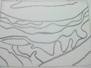
The next word describes rhythm, for this I have chosen an object that I was able to place my viewfinder over. The image below is showing a red cabbage, within this image are wonderfully repeated lines which can be described as a rhythm.

So once again, I have placed my viewfinder over, but in this case I have looked at different possibilities within the image.


Any one of these could produce a really interesting picture, I chose the middle one because I liked the simplicity of the two horizontal thicker lines of the cabbage. Here it is below:
Just to explain why I have asked you to do this, before we go on to what will do with these images, I would like to add, that as artists/designers/craftspeople we have so much choice, even more choice when working with textiles. It is important to start thinking about choice when we make pictures or designs because unless we think about it first, we are not beginning with the best possible chance of a really great piece of work.

Now to the Textile Work:
Ok, so what will be doing with your sketch? Simply this: Make a background that matches the size of your window/viewfinder, in other words the size of an atc. Make this background in any material of your choice. Then using a contrasting thread work the lines of your drawing in a running or backstitch.

To transfer your image:

If you think you may have a problem working these free hand then you can either use your tracing or a fun way to transfer an image onto a flat piece of fabric like cotton is to rub some crayon all over the back of your drawing and placing it over the fabric draw firmly with a sharp pencil to transfer the image. Obviously the crayon has to be a contrasting colour in order to see it. Hopefully your thread will be thick enough to cover these crayon lines.

One last thing that I didn’t mention is that is the orientation of your image. It is up to you whether you use landscape or portrait for your images. Mine above are both landscape. They could have been drawn either way, try your rectangular window either way to see what suits.

So to recap:
* Make viewfinder (Size of an ATC)
* Choose either of the following words

Dynamic (Creating Drama using Diagnols or

Rhythmic (Repeated lines.)


* Find an image that can describe the word you have chosen.
* Place viewfinder over image and find the best view.
* Draw or trace the image.
* Transfer your image on to fabric.
* Using a contrasting thread work over the lines in either running
stitch or backstitch.

If you have any queries or comments about this challenge please do not hesitate to contact me. Best of luck Tricia x